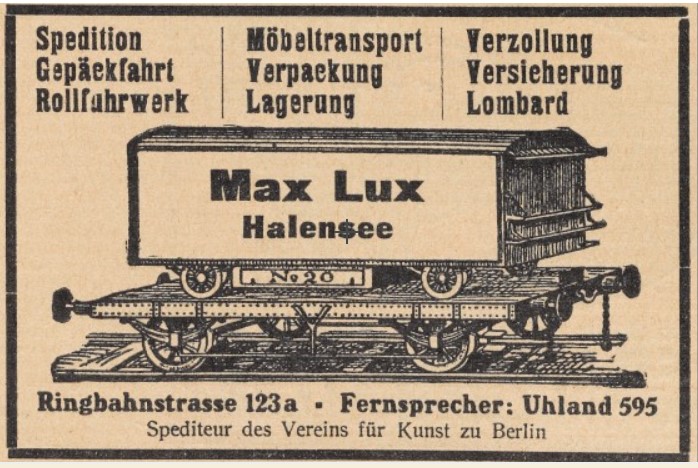
The first page of The Gift contains an invisible text: not an encoded acrostic or anagram, as in the infamous story “The Vane Sisters,” but, rather, the words blazoned on the side of a moving van on The Gift’s first page, written in dark blue letters, “each of which (including a square dot) was shaded laterally with black paint: a dishonest attempt to climb into the next dimension.” The words, so boldly announced and vividly described here as a physical (color, shape, size, style) but not linguistic part of the novel’s opening scene, are not revealed until more than twenty-five pages have passed: “Max Lux.” Readers of Gavriel Shapiro’s Sublime Artist’s Studio (Ithaca, 2011,148-50) or its citation in Dolinin’s new commentary (Kommentarii k romanu Vladimira Nabokova Dar, Moscow, 2019, 89), will know that the moving company Max Lux turns out to be real, and Shapiro reproduces a newspaper ad from around 1912 showing a representation of a rail car bearing the firm’s name; the following similar ad (from this source), appears to be the one Dolinin includes:
Shapiro associates the firm’s name with the painting “Light” by Gabriel von Max, an idea that may be reinforced by another of the novel’s details, on which more below, in the afternote. I have suggested that the conjunction of Max, light, the van-renters’ name Lorentz, and the rainbow refraction left behind when the van departs, points to physicists Ernst Mach, Hendrik Lorentz (and indirectly to their precursor Newton and successor Einstein) and the “revolution in science” and “new model of the Universe” that their work brought about (The Quill and the Scalpel, Columbus OH, 2009, 147-8). But these possible allusions are not the only interesting part of the novel’s theft of this van’s name. Dolinin first observed in his commentary that the firm’s name or logo, as shown on the rail-car’s side, includes no sign of a “dot” (or точка in the Russian). Where did this dot come from, and what purpose or meaning does it have within the firm’s name?
There are two additional noteworthy differences between the firm’s representation in the novel and what the ads show: first, we do not see a van with a tractor in the nearly identical images Shapiro and Dolinin have discovered. That seems a minor shift, perhaps an interesting one. Much more significant is the fact that in the ad as they found it, the company’s name does not include lateral shading to imply three dimensions. Advertising for the firm from the 1920s and ’30s has not been discovered, and so far no period photographs of their vans or rail cars have been unearthed either, so we do not know exactly what Nabokov might have seen. The newspaper ads apparently ran during years prior to Nabokov’s time in Berlin, in Der Sturm from 1912 to 1919 (Dolinin, 89). There were display ads with shaded lettering in those decades (see the image from D. Zimmer, and discussion, below), and it violates no rules of artistic creation to think that Nabokov imaginatively modified, “rechewed, and rebelched” what he found in life, using it for a variety of suggestive purposes. But what were those purposes?
The shading has some obvious implications that tie in thematically to Nabokov’s devices in The Gift and are especially relevant in this textual neighborhood. First, shading implies not only a third dimension, but a source of light creating the shadow, deepening the pun on the word “Lux”—especially if that word also references the painting by Max, “Light.” More on the light source in a moment. That “dishonest attempt to climb into the next dimension” teasingly suggests the possibility of still further dimensions beyond the ones we ordinarily perceive. Yuri Leving has proposed that the dot’s shape, too—a normally circular mark that here shows up as a square—is “a manifestation of the notorious ‘next dimension’” (Keys to The Gift, Boston, 2011, 349), though metamorphosis seems closer to the mark, in this instance. In any case, both the shading and the dot are artistic embellishments to the found “reality” (as far as we know). To reiterate, the shading itself suggests extra dimensions (a third, where there are only two), and a source of light (on a mostly cloudy afternoon, no less) blocked by a solid body. The illusion of depth also, of course, highlights the very feature of “realism” under discussion on the novel’s pages in which “art” attempts to look like “life,” inviting readers to think about the elusive boundary between these two facets of being, where art grades into life, which grades back again—a major theme within The Gift, as it had been in the novel’s key predecessor, Eugene Onegin. The source of light, thus imagined, might be the artist—or, it might be the reader, or any human being who looks carefully enough at the environment’s details to notice the slippages and cracks in a superficially unblemished façade of being.
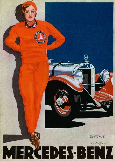
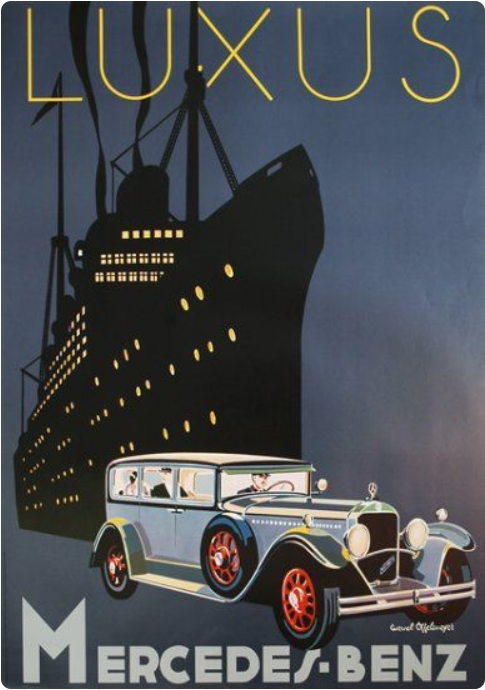
Back to the dot. Dolinin, in noticing that the dot is missing from the “real-life” Max Lux advertising, presumes that in the novel’s reality it is a period indicating abbreviation of the first word, which Nabokov added to emphasize the implied meaning “maximum,” leading to the concept of “maximum illumination” and Goethe’s last words, “Mehr Licht!” (he seems not to be convinced by Shapiro’s Gabriel von Max theory). But, curiously, the text version of the van’s legend, when the name is finally revealed, reads simply “Max Lux” with no punctuation—or, rather, with just the sentence’s closing punctuation (a period) coming right after “Lux,” casting significant doubt on the idea that there is a period abbreviating the first word in the text Fyodor sees. Imagining the van’s tochka last, after Lux, seems even less likely (such placement was common enough in display advertising in earlier decades; it seems to have been rare or absent by the 1920s). Suddenly, the existence of the dot itself takes on a rather nebulous and suggestive character within the narrative. Why does Fyodor (or his narrator) not reproduce the dot he supposedly saw on the van’s side on the novel’s first page, when he returns to it dozens of pages later? There are at least two possibilities: first, that there was no dot even in Fyodor’s field of vision, and he chose to add it during the first scene, imaginatively, but not literally in the later scene. Another possibility is that he (or Nabokov) forgot about the dot when writing down the firm’s name (which, again, would be very unlikely if the first name were intended and understood as an abbreviation). There is one kind of dot which could have appeared on the van’s side without signifying anything about the words themselves: a decorative separator dot, mid-height above the letters’ base line. This kind of dot, although rare in available images of advertising in Germany from those years, does appear in a 1928 display advertisement for Mercedes-Benz (without shading, though the renowned “Woman in Red” featured in the ad and designed by Edward Cucuel Offelsmeyer is, in fact, shaded to the left)—and elsewhere, as we shall see.
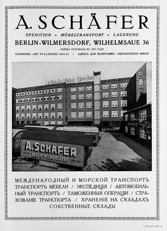
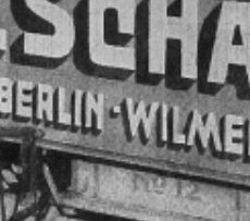
The key difference between the version of “Max Lux” shown above and the version in Shapiro’s book is that the latter’s image has abbreviated street names at the bottom, and a colon rather than a mid-height dot separating the two addresses—one possible source of inspiration for an imaginary mid-height dot. Dieter Zimmer, in his Nabokovs Berlin (Berlin, 2001, 91), discovered another advertisement, from the 1921’s émigré magazine Zhar-Ptitsa (“Firebird” [No.3, October, repeated in No. 6, 1 Jan 1922 and probably elsewhere]) showing another rail car with a different moving company, “A. Schäffer,” whose letters are indeed shaded on the left, including all three (very square) dots—and a fourth dot, also shaded, mid-height between the city names “Berlin” and “Wilmersdorf.” The letters appear to be white—definitely not dark blue—against a colored background that can’t be guessed, though probably not yellow. (Leving suggests that the fictional van’s yellowness connects it to Sasha Chernyi’s 1926 story “The Yellow Moving Van,” a very plausible supposition [Keys, 347]).
Again, reality puts no limits on the imagination of an artist, but still placement as a separator conforms best both to the words as we have them (“Max” still implies “maximum” even without an abbreviating dot), and Fyodor’s neglect of the dot in his report of the firm’s name. Thus, if Fyodor indeed saw a shaded dot on the van’s side among the yard-high letters, it was most likely a decorative feature, one might even say an empty space made tangible or blank space made visible through typography—yet another form of metamorphosis or dimensional climbing.
But why add this dot? We are assuming here that “Max Lux” never, in the 1920s or ’30s, appeared in exactly the form described in the novel, which so far is unknown, though a thorough review of era photographs and newspapers could establish this. (Early efforts have revealed that due to wartime bombing, photographic records of German cities from those decades are sparse.) Assuming that the van represents a partially real, partially imaginary or creative phenomenon (“real” in whose world? Fyodor’s, an imagined author/narrator’s “superior” to Fyodor, or Nabokov’s own biographical world?), it might be taken as the shuttle or transport between those worlds of reality and imagination. (According to Leving, “Means of transportation in Nabokov often occur as an intertextual mechanism for carrying literary allusions and traditions” [Keys, 350]). The dot, if indeed it sits in the middle of the name, would serve as a fulcrum or even perhaps the exact point of transition—if we imagine the words themselves as a visual representation of two domains, separated and connected by a space/dot/tochka.
The word “point,” added to the discussion in the previous sentence, brings us to yet another layer of what may be happening in the two scenes (one of physical viewing on the first page, one of remembering and creatively reimagining as “mak-s, luk-s,” poppies and onions, much later [Gift 29/SSRP v4, 215]). We have at least three translations of the word tochka: dot, period, and point (British English would replace “period” with “full-stop”; a fourth translation will appear shortly). As has been widely discussed in scholarship on Invitation to a Beheading, the tochka becomes the most important emblem of personhood or individual identity in that novel, or at least in Cincinnatus’s ruminations on the subject of his own being and essence:
I am taking off layer after layer, until at last . . . I do not know how to describe it, but I know this: through the process of gradual divestment I reach the final, indivisible, firm, radiant [сияющей] point, and this point says: I am! like a pearl ring embedded in a shark’s gory fat—O my eternal, my eternal . . . and this point is enough for me—actually nothing more is necessary. (Invitation, 90/SSRP v.4, 98)
One of the first and best close readings of this passage is by D. Barton Johnson (Worlds in Regression, Ann Arbor, 1985, 168), who also noticed that later in the novel, “tochka” is once translated as “spark,” another connection to light in the word’s semantic orbit, also seen above in the phrase “radiant point/сияющей точки” (Worlds, 169, Invitation, 136). The passage represents a soliloquy on the word “tochka/point” in this particular meaning—whatever the meaning is: soul? self? spirit? consciousness? Invitation was drafted in the midst of The Gift’s conceptualization and early writing, after Chapter Four and the spin-off story “The Circle” but before Chapter One was composed, and therefore it is highly probable that an anomalous, almost mysterious tochka in the larger, embracing novel—one might call it “fleeting” or, in Russian, “мнимый”—bears a direct relation to the smaller, embraced one. (Possibly, this connection strengthens the theory, whispered at conferences, that Invitation might be viewed as Fyodor’s creation). The dot, grammatically insignificant and smallest on the van’s inscription, and perhaps not even really there (whatever meaning for “really” we choose to endorse), becomes after all the most important among the graphical signs: a radiant spark, artist’s signature, or simply his metonymic trace, perhaps even his metaphorical substitute; this dot may be an embodiment of the creative (perceiving) individual’s presence in the scene, observing the van’s many features, translating them into a personal idiom, generating from them a compressed reenactment of the aesthetic process.
The aesthetic moment, as figured here, highlights both the creator-artist (however identified), and the intensely engaged reader—what Nabokov would later call “the creative reader” who is a “rereader” (Lectures on Literature, 3). After all, the scene itself is a moment of reading, and an allegory of productive, creative apprehension, as Fyodor examines the words on the van’s side, perhaps embellishes them (shading, dot), turns them into one explicit fairy-tale (“Onions, your Grace”) by pushing the words illegitimately across another boundary, by means of cross-linguistic punning (Max=мак-с, Lux=лук-с). Fyodor’s reading is playful, but also serious in that it creates a world, and characters, and story, out of something as banal as advertising copy: a false start, perhaps, but one that demonstrates a belief that the world is there for us, receptive and responsive to our conscious engagement, and filled with perhaps infinite creative opportunity. It is the tochka—the person, the artist, the creative reader—who brings the given world out of passivity and says, according to Nabokov, “Go!” (LL, 2).
Now, to anticipate a question: what if it turns out that there was a “Max Lux” van in the 1920s or ’30s that did include a dot of some sort, and perhaps even lateral shading, dark blue on yellow? A slightly increased modesty of claims would be called for: the emphasis on the tochka, the shading “into the next dimension” still all bring forth the central thematics from Invitation; and the name’s offshoot, the imagined folktale scene about poppies and onions, no less emphasizes the creative drive saturating an engagement with a text. (The dimension-crossing is echoed yet again when “on the gray convex roof of the van, the slender shadows of linden branches hastened headlong toward substantiation, but dissolved without having materialized,” [Gift,7]). Existence of a “real” van exactly like the one Fyodor describes would result in a slight reduction in the quantity of reverberation of these themes within this scene, but not the essential ramifications of the scene itself, or the implications of its contents. What we have, on the first page of The Gift, appears to be a conjunction of the creative writer, the creative reader, and the found object that sparks the inner life of the individual in relation to the world.
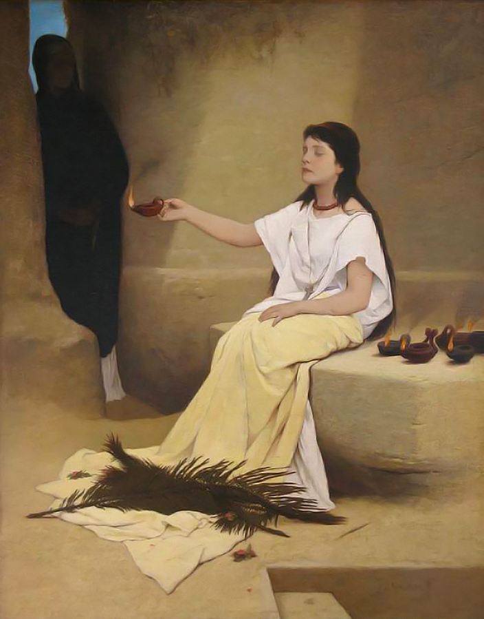
As an afternote, I want to return to the Gabriel von Max painting identified by Gavriel Shapiro—Max’s “Light” or “Licht” or “Lux.” The painting is understood to depict a blind young woman dressed in white cloth, seated, with a collection of small, burning, oil lanterns beside her, and one in her hand which she is offering to a woman standing in the shadow to her right, the viewer’s left. (The large black feathers at her feet surely have been interpreted, but are not part of this analysis.) This blind young woman purveying light may be obliquely echoed as well, in the novel’s Chapter Three, by the legless old woman, “set down like a bust at the foot of a wall [. . . ] selling paradoxical shoelaces” (Gift, 163). At the least, we see here a clear parallel between the kind of scene that attracted Gabriel von Max’s interest, and the objects of Fyodor’s own creative perceptions.
Appendix. Another Offelsmeyer image from the 1920s for Mercedes-Benz, with a dot instead of hyphen, curiously blended with the cruise liner brand “Luxus”:
This Note was stimulated by a lively discussion between the author and Alexander Dolinin on his recent commentary.
-- Stephen Blackwell, Knoxville, TN